Together with Nicole Geiger and Nancy Austin of the Yosemite Conservancy, I set out to make a map of some of the significant Yosemite big wall climbs that Glen Denny was involved with during the 1960s for his book Valley Walls.
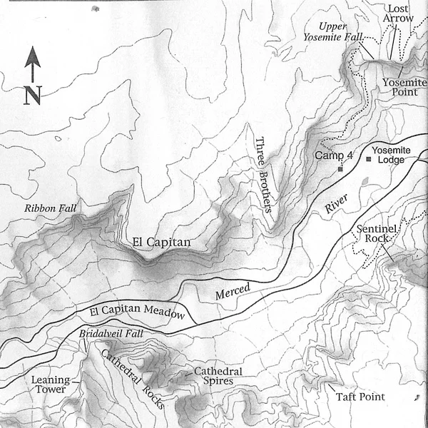
We began with the simple black & white maps Glen remembered from park brochures during that era:
Both of these examples use dark outlines and shading to indicate the locations of cliff faces. But these standard planimetric maps do not provide a good angle to view the walls themselves, where the action takes place.
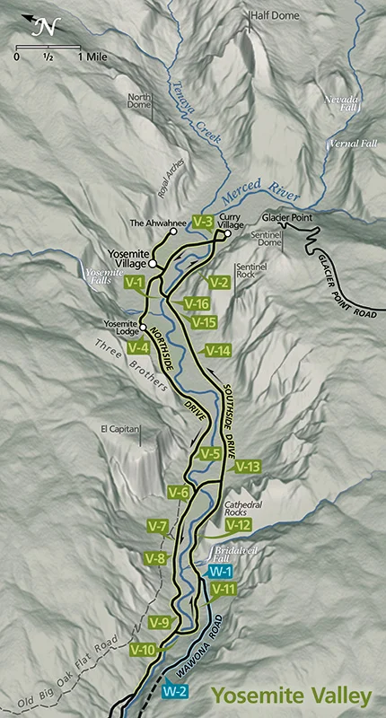
I thought this might be a good opportunity to try a variation on the 'planimetric oblique' maps I did for an earlier Yosemite Conservancy project, Bob Roney's Road Guide To Yosemite, in which cliff faces appear in profile:
On the left is the digitally rendered original, and on the right you can see how I sketched in and highlighted the important climbing formations in a more recognizable style. But to someone familiar with Yosemite they're a bit dainty, especially compared to the dramatic angles and bold contrast of Glen's climbing photographs:
As he put it, "too much Debussy, not enough Wagner." Fair enough!
Glen remembered a map he had seen that used a similar perspective, but with cliffs that looked more muscular and...Wagnerian. It was a panorama of the entire park by Heinrich C. Berann, well known for his tourist maps of the Alps:
Berann's genius is well documented, so I'll just say that he was a master at tweaking and warping the proportions of his landscapes into compositions that exaggerated their most prominent and familiar features. This required minimizing or eliminating the intervening, unimportant terrain, without sacrificing basic map functions such as the general locations of roads or towns.
Using his portrayal of Yosemite Valley as a new starting point for our b&w map, the first task was to fit everything onto the page and make sure all of the climbs referred to in the book were visible. I made a few adjustments to the proportions of individual formations, such as tilting back the face of El Capitan (too steep), shortening the face of Half Dome (too high) and trimming back the Four Mile Trail area behind Sentinel Rock to reveal the Glacier Point Apron and Staircase Falls.
We changed the configuration of roads and visitor facilities on the valley floor to match the early 1960s, and added callouts for the routes and a stylish title based on the original Camp 4 sign:
And here are the results, in four stages from original painting to final map:


